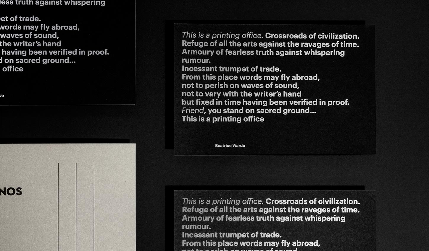
Crossroads of civilization
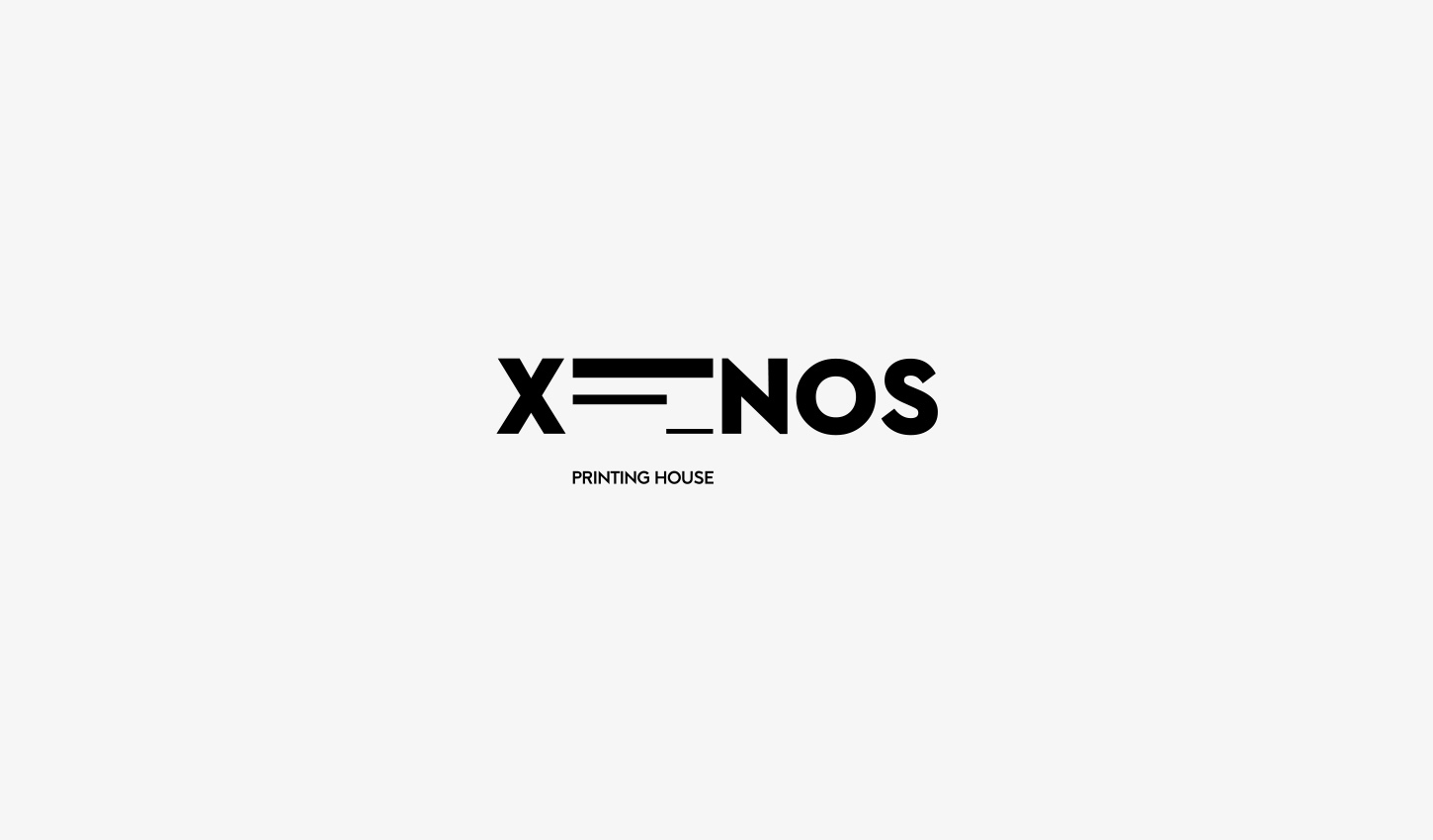
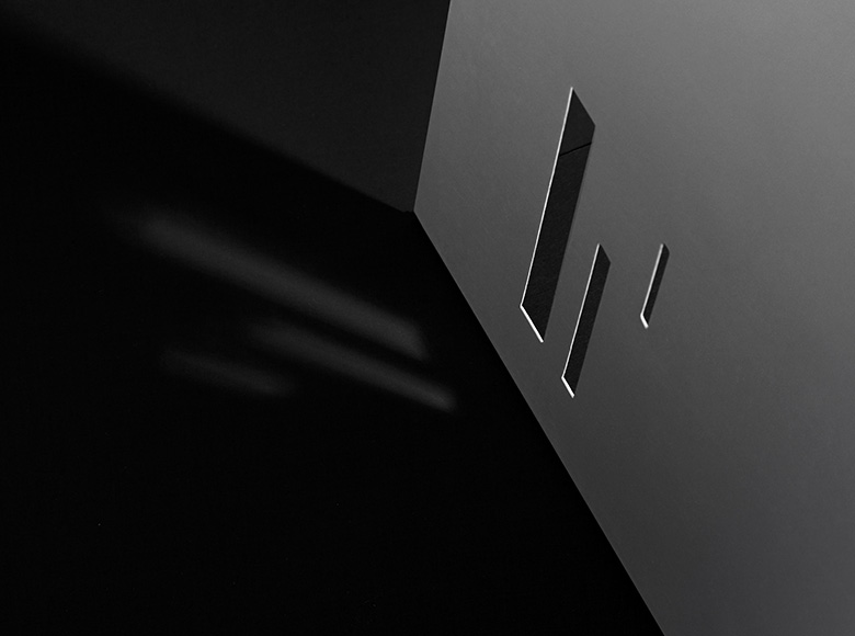
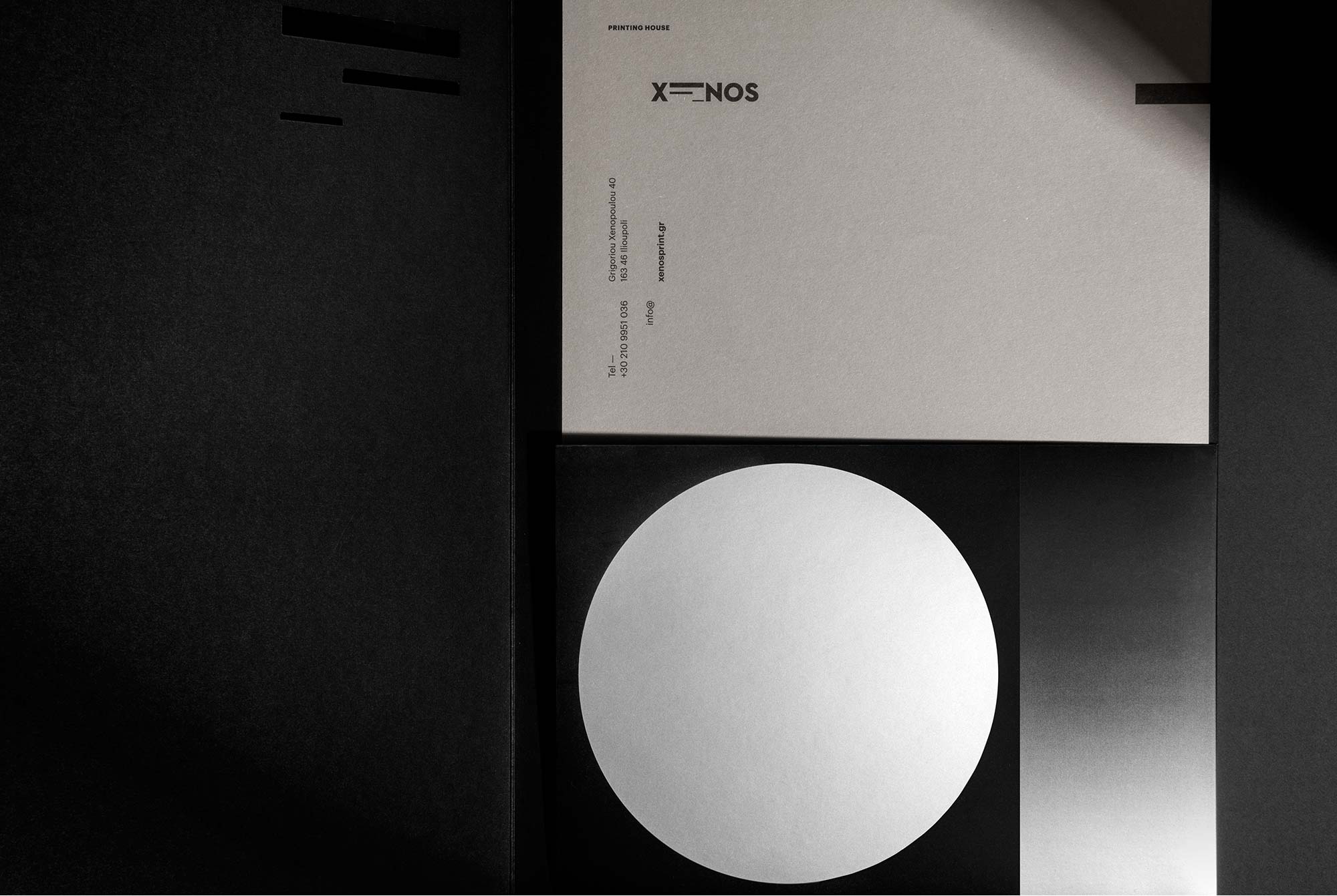
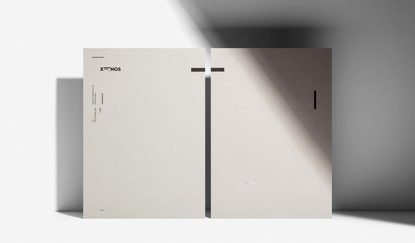
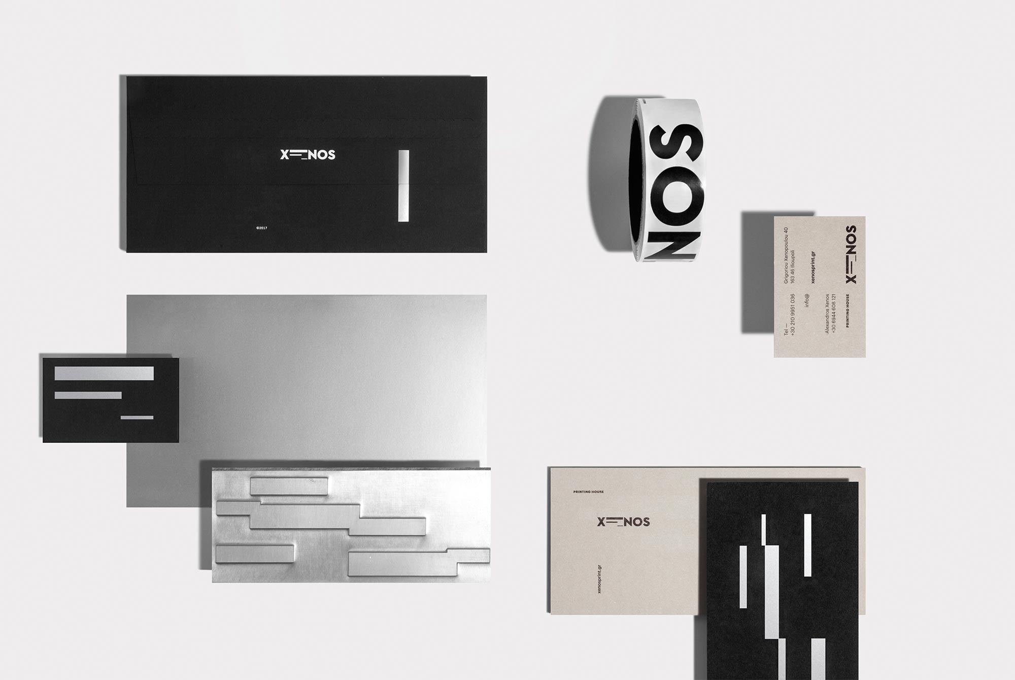
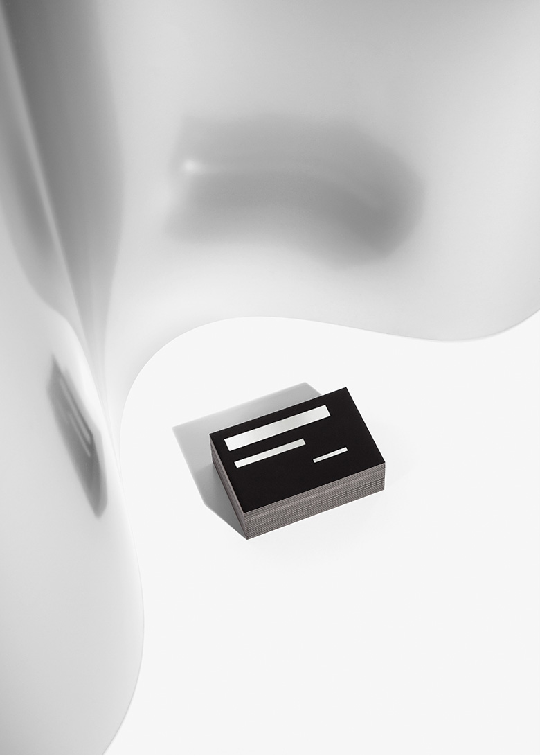
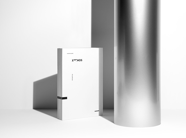
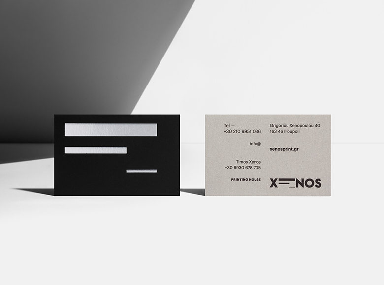
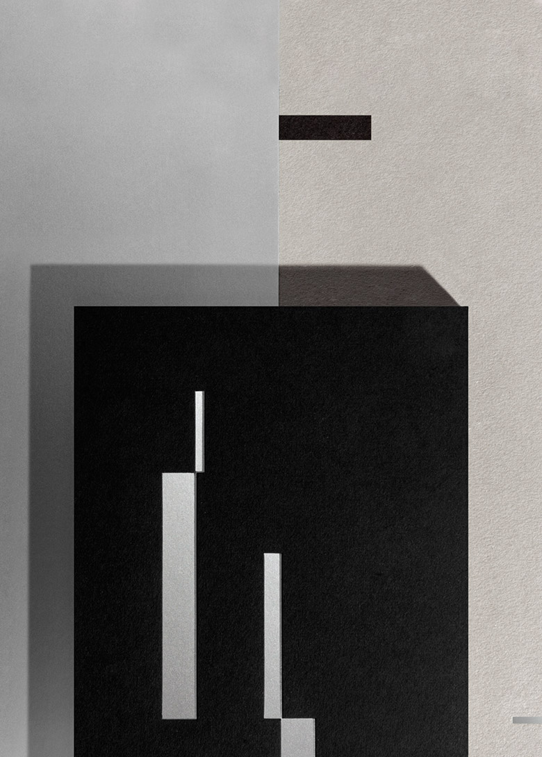
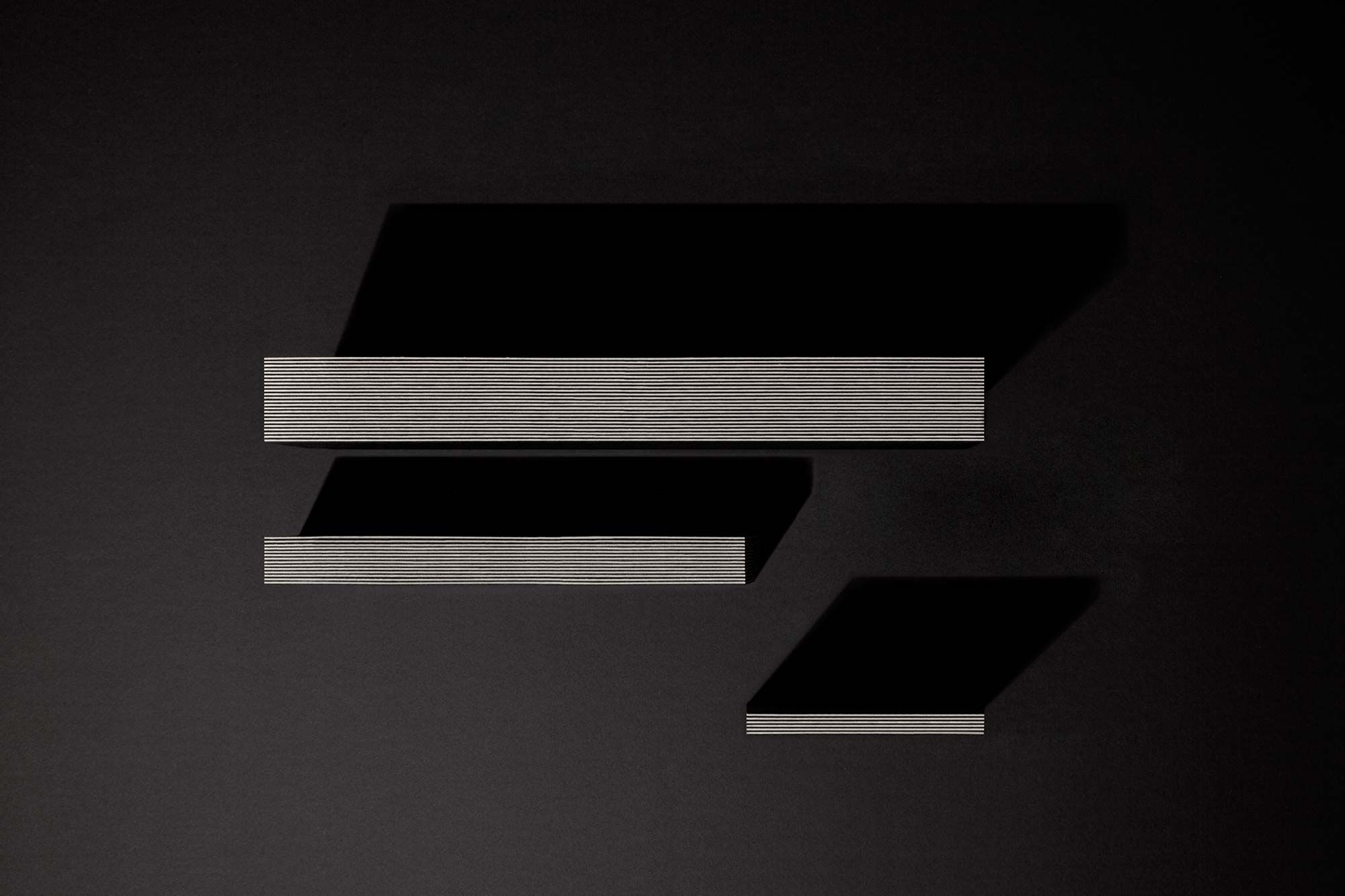
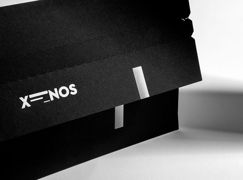
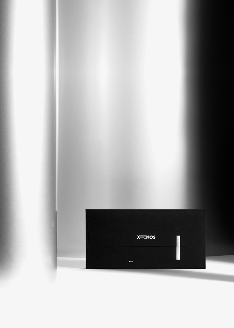
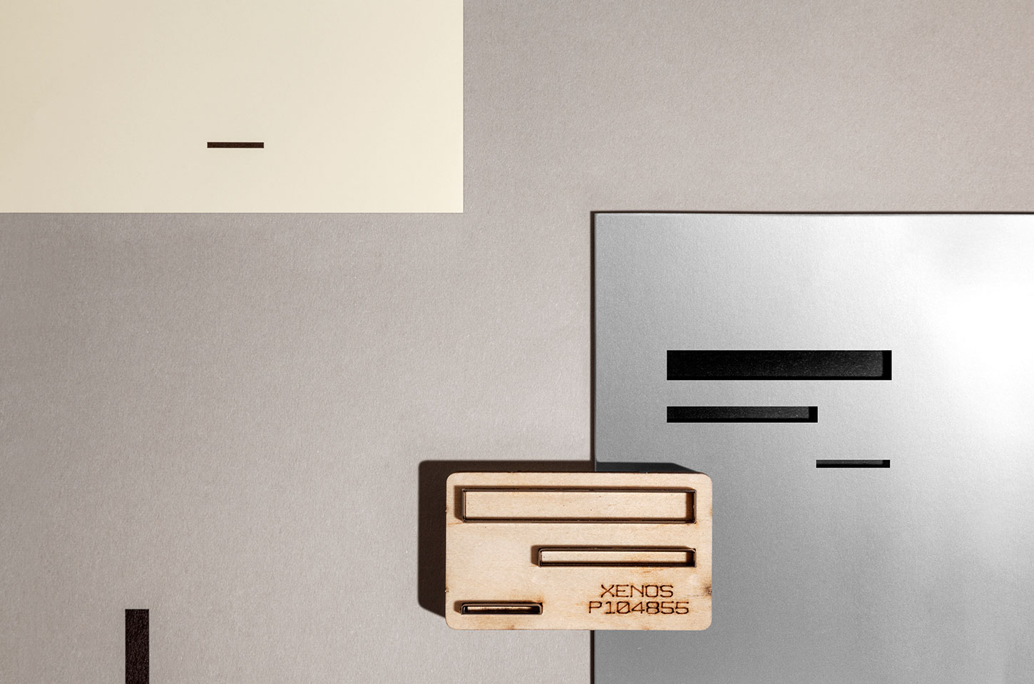
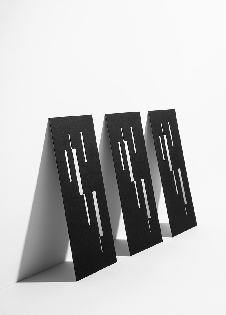
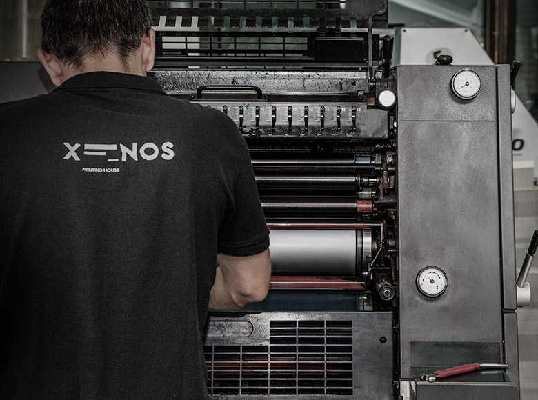
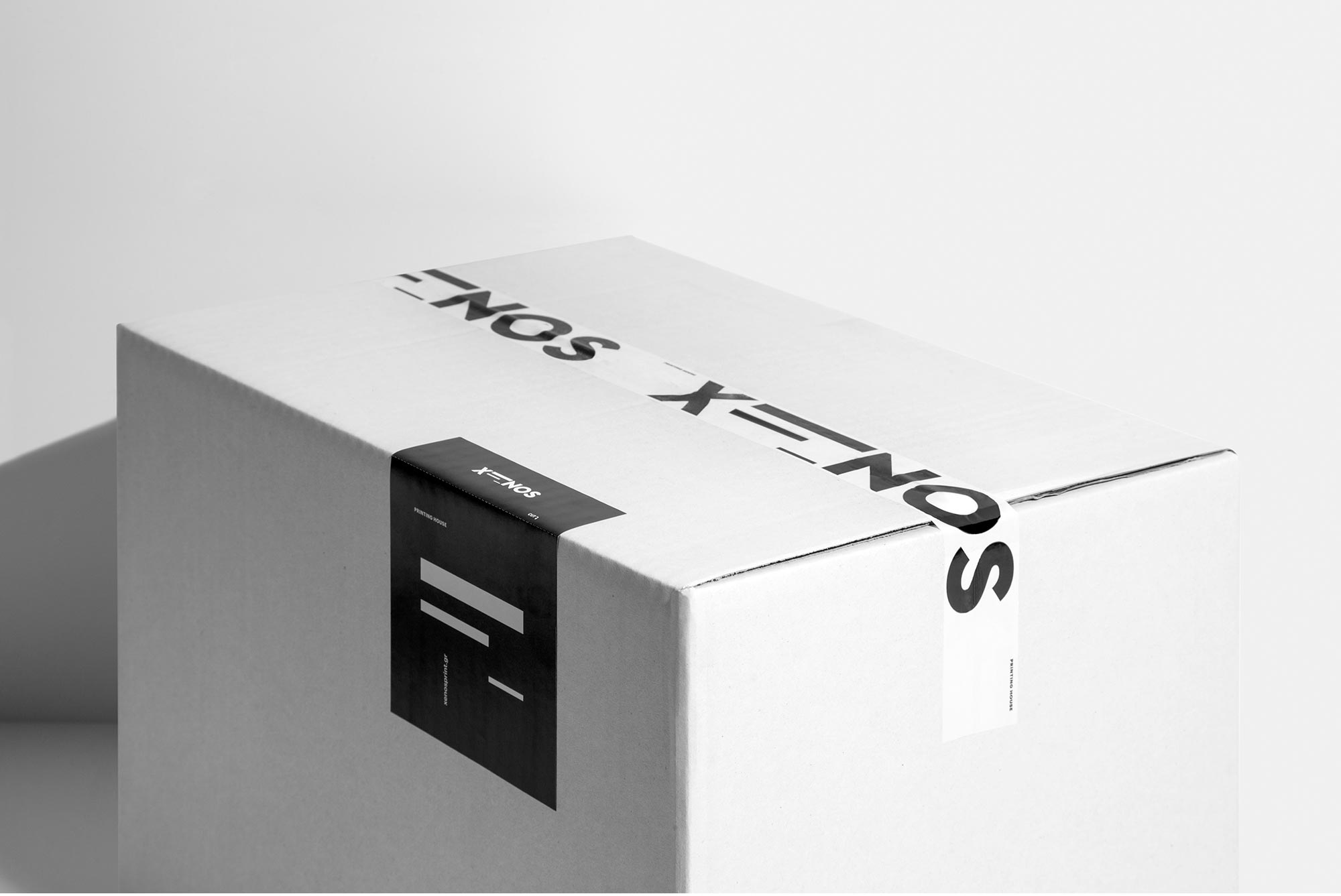
Logotype and corporate identity for Xenos Printing House. For designing the logo, we used geometric forms as a degradation of the Greek letter ‘Ξ’. Inspiration came from the crop marks and matching points of the printheads, the composition of text by arranging physical types in typesetting, as well as the printing plates and the paper piles of the offset printing machine.
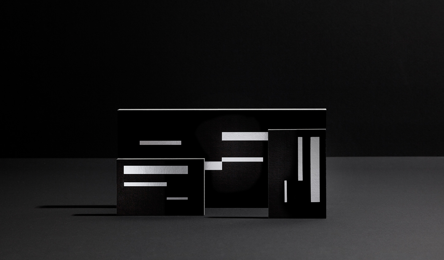
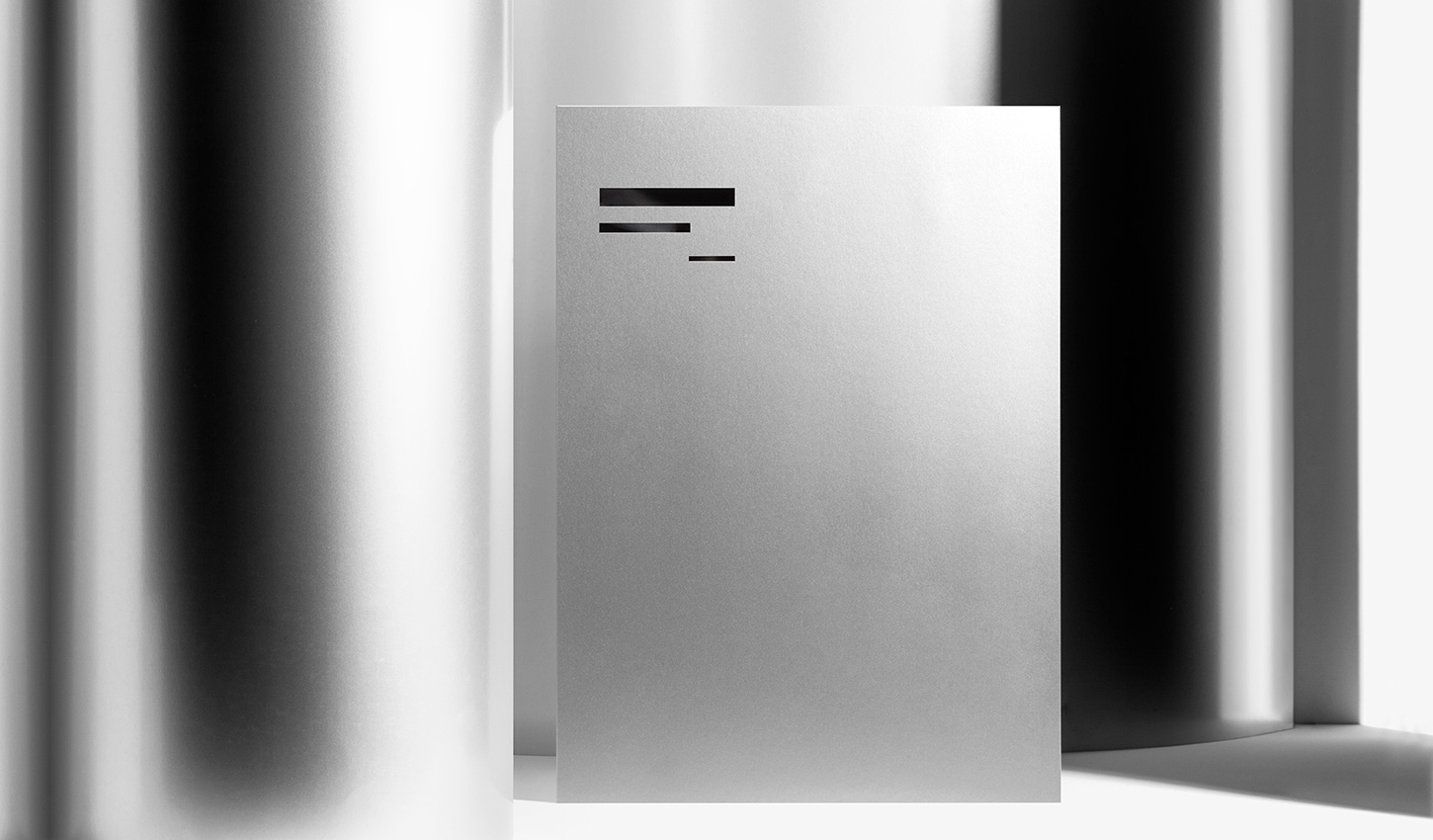
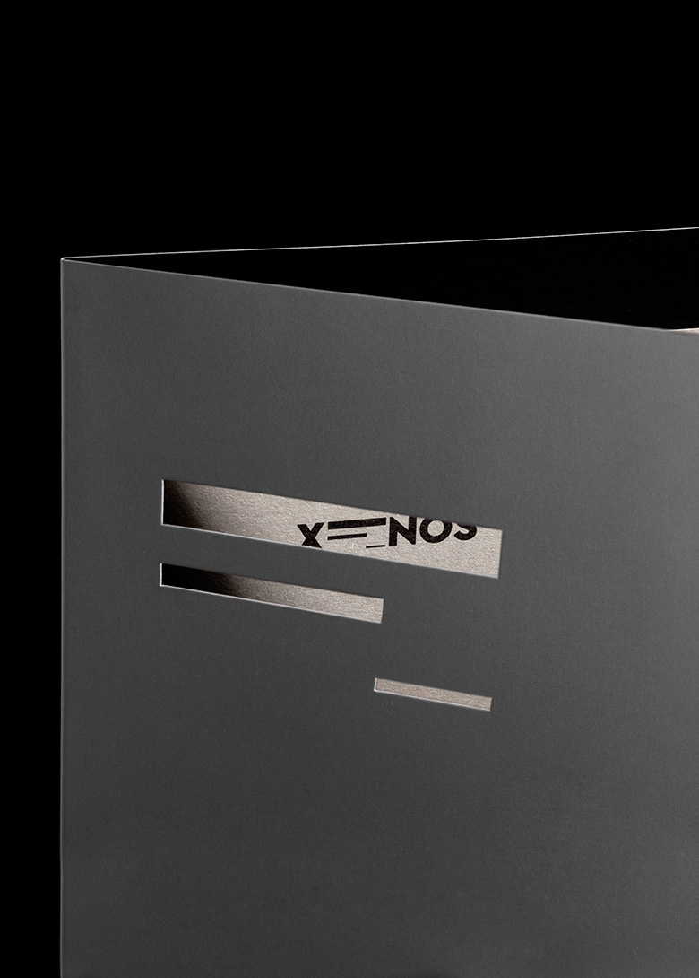
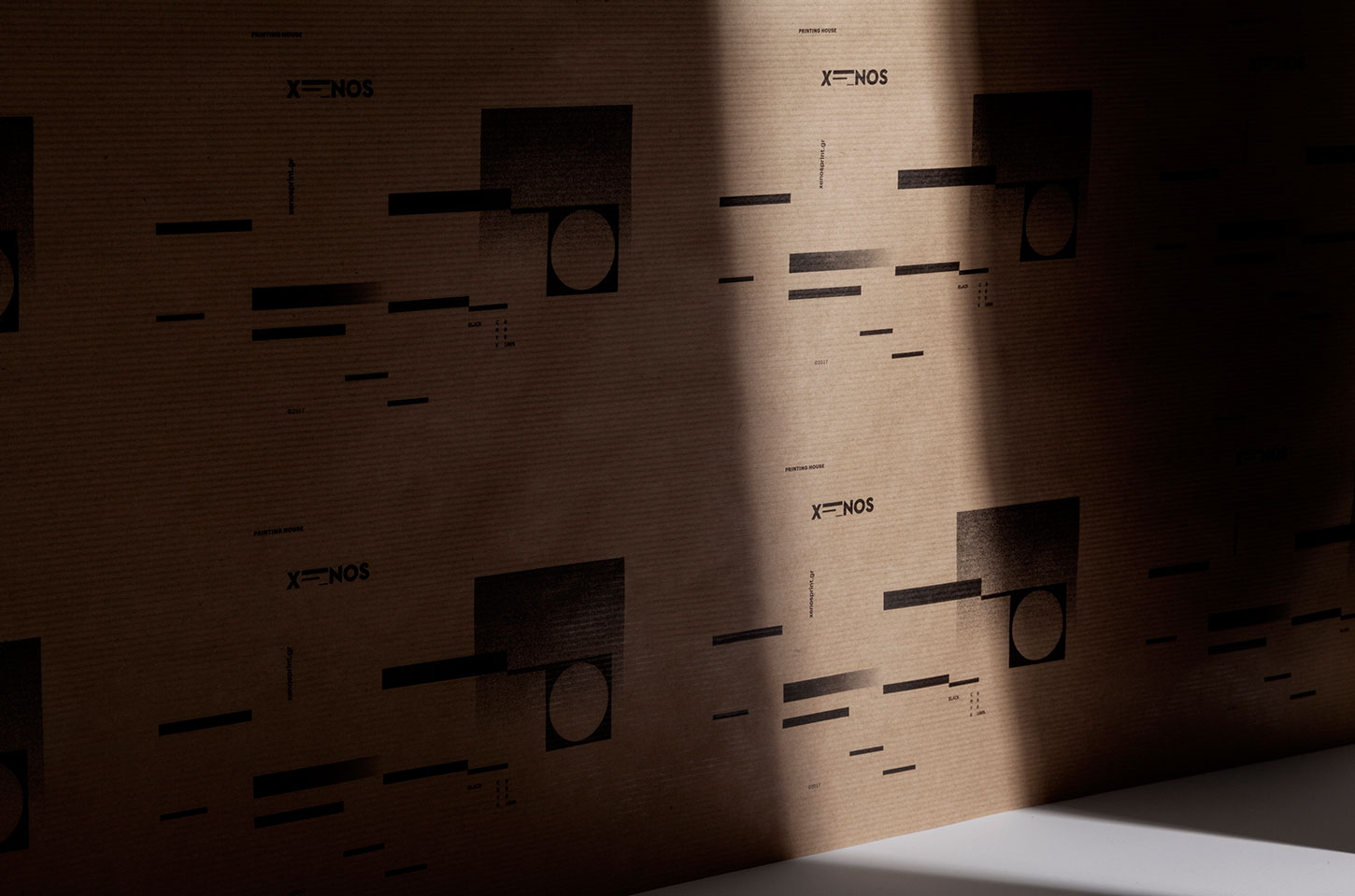
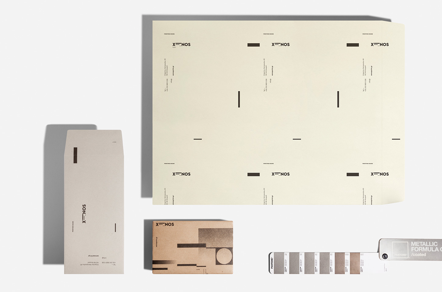
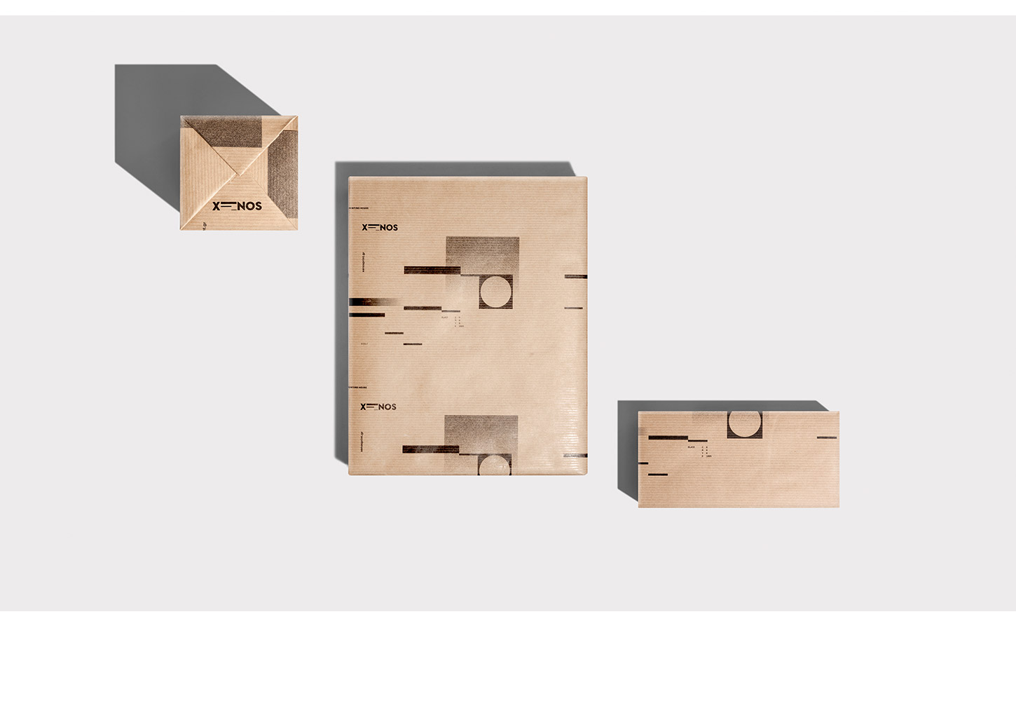
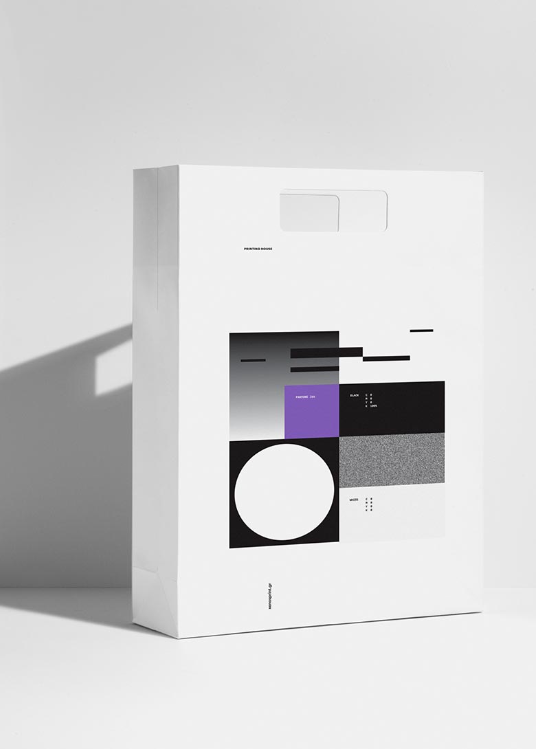
Expanding that sense throughout the branding identity and its applications, we designed geometric elements, such as the cylinder, as a reference to the ecosystem of the printing house, creating compositions of monochromatic printing passes. For producing the applications, we chose special papers, combining different printing techniques. A noteworthy detail is the reference to the photo-transfer technique, a simulation of the printing plate on the corporate folder. The overall result narrates a story in abstraction of everyday life in this unique space.

We focus on branding and design with purpose. We produce every project with passion, achieving expressive, bold and innovative communication.
STUDIO
We help brands empower their vision through meaningful design solutions.
We are a group of creatives with expertise in different skills, providing innovative alternatives beyond the predictable.
Numbers in our agency remain consciously small, while a solid network of professionals complements our work.
Every single project can be monitored at any stage before its completion, in a flexible and effective manner.
Designers communicate directly with clients, taking their needs into account and helping them gain their share in the domestic and international market.
Drop us a line.
We're looking forward to speaking with you.
Distinctions ___


Branding ___
Creative direction
Logotype
Visual identity
Packaging design
Naming
Printing material design
Signance & Enviroment
Logotype
Visual identity
Packaging design
Naming
Printing material design
Signance & Enviroment
Digital ___
Website
E-commerce
Application
Content development
E-commerce
Application
Content development
Production ___
Photography
Print process
Supervision
Print process
Supervision
-
Publications ___
-
Responsive LogoSandu Publishing, 2018
-
Monocle, Issue 109Monocle, 2017-18
-
Slanted #30 - AthensSlanted Publishers, 2017
-
Regional Product PackagingImages Publishing, 2017
-
BRANDLife: Concept Stores & Pop-upsVictionary, 2017
-
Los Logos 8Gestalten, 2016
-
Clothing Packaging DesignImages Publishing, 2016
-
Takeaway Food Packaging NowImages Publishing, 2016
-
Logo ParadeSandu Publishing, 2016
-
Gallery magazineChois publishing, 2015
-
Sample. magazine2015
-
Unpack Me Again!Sandu Publishing, 2015
We shape our team. We stay nimble.
We are always on the lookout for effective and creative people. We currently have no positions or internships, but you may send us your portfolio for consideration in the future.